This morning the work crews had blocked off the intersection of Gay and High Streets and were busy putting up Current, the sculpture that hangs over that intersection during the warmer months of the year. The sculpture isn’t designed to withstand the weight of accumulated snow, ice, and freezing rain, so they take it down over the winter months. It’s actually a bit aggressive to put it up in early April, because Columbus has been known to get April snowstorms from time to time. None are in the short-term forecast–but April weather is notoriously fickle and can turn on a dime. We’ll just have to hope it stays above freezing.
As I watched the workers and cranes hoist Current into place, I was briefly tempted to go up to one of the guys in a hard hat and say, with a serious expression on my face: “Aren’t you hanging it upside down?” They probably wouldn’t have thought that was very funny, however.
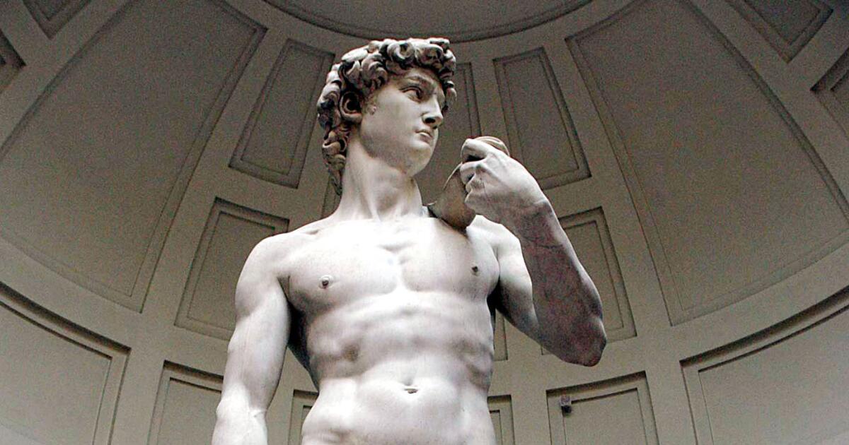
Michelangelo’s David is generally regarded as one of the supreme artistic creations in the history of the world. Housed in the Galleria dell’Accademia in Florence, the colossal statue is breath-taking, magnificent, and inspiring. A visit to see David should be a bucket list item for any art lover.
David was completed in 1504, and in the 700 years since it has become an iconic image. Like any iconic image in the modern world, David has been commoditized. You can buy fluorescent plastic reproductions of the statue, t-shirts of David blowing a bubble or David hoisting a wine glass, or other goods featuring various parts of his body or face. But . . . is that proper? Or, should Italy be able to protect the dignity of this monumental artwork, and prevent it from becoming the subject of the kind of trashy junk sold in souvenir shops?
That’s an important question, because the director of the Galleria dell’Accademia has been using an Italian law to stop commercial exploitation of images of David that she considers to be “debasing.” She has encouraged the state’s attorney office to bring lawsuits under Italy’s cultural heritage code, which protects artistic works from disparaging and unauthorized commercial use. In most countries, artwork falls into the public domain within a set period after the death of the creator–and once a piece falls into the public domain, people are free to make use of its image. Interestingly, Italy is one of many countries that has signed a convention recognizing that approach.
The world obviously doesn’t need more cheap plastic knock-offs of David any more than it needs more t-shirts of the Mona Lisa wearing sunglasses–but there are obvious issues of free expression and free speech that also come into play. Who is to decide what is to be considered “debasing” or disparaging, or what should be authorized? Should Monty Python, for example, have been permitted to use the image of Botticelli’s Birth of Venus in a hilarious and arguably disrespectful way in one of its shows?
I come down on the side of free speech on this issue, and I think the notion of allowing artwork to pass into the public domain within a reasonable period after the artist’s death makes sense. And, at bottom, I really don’t think that the commercial uses of David are “debasing” of the artwork itself. I think that David, the Mona Lisa, Van Gogh’s self-portrait, and other supreme artistic accomplishments can withstand some crass commercial profiteering. If anything, that cheap neon plastic statue of David might just cause someone to want to go see the awe-inspiring original, in all its glory.
Well, we met one resolution at least. We finished the 1,000-piece puzzle of van Gogh’s The Starry Night on the first day of the new year, with a few hours to spare.
As always happens with puzzles, it was tough sledding for a while, as we proceeded piece by painstaking piece, but at some point we hit a critical mass, and the last 50 pieces flew into place in a frenzy of puzzle-making.
If only my resolution to lose weight was as easy to keep!
Happy New Year! We hope the new year is one of happiness, fulfillment, peace, and contentment for everyone.
Speaking of which, our first resolution for 2024 is to finish this 1000-piece puzzle of Vincent van Gogh’s The Starry Night by tonight. Like many New Year’s resolutions, it is potentially achievable, but will be a significant challenge.
I really like this painting and van Gogh’s artwork generally, but did he really have to use so much blue paint?
“Current,” the large, fishnet-like sculpture that has been hanging over the intersection of Gay and High Streets in downtown Columbus for the past six months, came down yesterday. The piece is simply not designed to endure a Midwestern winter, when it would be required to bear the accumulated weight of snow, sleet, freezing rain, and other seasonal weather delights. The sculpture will be put on a rotation in which it will be installed in the spring, removed on the cusp of winter, and then spend the frigid months in artistic hibernation.
The removal of the sculpture was a significant operation. The intersection was blocked off, a big tarp was spread over the asphalt, and multiple cranes unlatched the sculpture from its support moorings and slowly lowered the piece to the ground. A number of hard-hatted people supervised the work, and they must have done their job well, because the effort seemed to come off without a hitch.
I got used to seeing “Current” overhead, and the intersection seems a bit boring and barren without it. We’ll just have to look forward to seeing it again next spring, when the reemergence of “Current,” like the return of the swallows to San Juan Capistrano, tells us that warm weather lies ahead.
The latest step in the artification process is painting these utility boxes at the intersection using the same red and blue color scheme that is used in the Current sculpture rippling above. So, instead of drab, institutional gray utility boxes, we’ve got quasi-psychedelic, red and blue utility boxes. There’s also a special seating area on the south side of Gay Street, just west of the intersection, where you can sit down on red and blue chairs and take in Current in all its glory. In short, the intersection is rapidly becoming a study in red and blue.
I like this, and I applaud the city for taking these kinds of steps, which make the downtown area more interesting. If you really want to allow people to appreciate Current, however, you’re facing some challenges–like the combination lamppost/traffic signal/walk-don’t walk sign poles that inevitably end up in the pictures people try to take of our overhead sculpture. But how do you safely remove or reconfigure basic traffic signs and signals from a busy intersection just a block from the heart of downtown Columbus? And for that matter, people would get a lot more enjoyment out of Current, and taking their inevitable selfie with the sculpture in the background, if they didn’t have to worry about dodging COTA buses and other traffic as they worked to frame the perfect shot.
To my knowledge, there are no plans to route traffic around this area, and make the Gay and High intersection a no-traffic, pedestrian-only zone. But if you are going to put up a nice outdoor sculpture, logically you want to create a setting around the sculpture that allows people to really enjoy it. Rumbling traffic, brief walk-don’t walk intervals, and view-blocking poles and street signs aren’t really conducive to art appreciation. I wonder if the next step in the downtown Columbus artification effort won’t be to remove these obstacles and make this intersection a pedestrian-only, open space where the Current appreciation can flow unimpeded.
Happy Fourth of July! May everyone have a safe and happy Fourth—unlike the unfortunate kid shown atop a rock in this consciously disturbing display in Brooklin, Maine.
Last night as I walked home from the Ohio Theatre I had a chance to take in the “Current” sculpture by Janet Echelman, which is hanging over the intersection of Gay and High Streets in downtown Columbus. It’s the first time I’ve really had a chance to see the sculpture from the street, in all of its lit-up, night-time glory. The photo above is taken from the Gay Street sidewalk just east of the sculpture, and the photo below is taken from the middle of Gay Street west of the sculpture.
I’ve decided the “Current” sculpture is pretty cool. The blue and red night lighting definitely makes a difference, and accentuates the interesting, quasi-geometric lines that support the rest of the sculpture. The lighting gives the piece a kind of whispery, spidery beauty, and shows the powerful interaction of light and structure.
There were a lot of people out in downtown last night at about 10 p.m., and I saw a number of people who were, like me, taking pictures of “Current.” That’s exactly what the urban planners were hoping for when they decided to install this huge piece of artwork over one of Columbus’ main downtown intersections.
If you visit Asheville, North Carolina–and if you like craft beer, hiking, or fishing, you really should–a visit to the Biltmore estate is a must-see item. We had a chance to visit a part of the house and grounds on our trip to Asheville, and it is an amazing place.
The Biltmore was constructed by George Vanderbilt at the height of America’s Gilded Age. The Vanderbilts were fabulously wealthy, and Mr. Vanderbilt was looking for a nice little country retreat for his family and friends. He chose this spot in the western part of North Carolina for his location–apparently, at least in part, because he was an avid fisherman, and the angling opportunities in this area were very attractive–and modeled the house on a French chateau. He definitely hit the target there, because from a distance the Biltmore house looks like it was lifted from the Loire Valley and plopped down into the North Carolina countryside.
We started our tour outside the house, of course, which allowed us to take in the exterior of the structure. The architectural detail on the facade–the slanting windows, the statuary, the lion figure standing guard, the ruffles and flourishes everywhere you look–all attest to the obvious conclusion that George Vanderbilt and architect Richard Morris Hunt made sure that no expense was spared. The overall effect is fabulous.
We entered the Biltmore House through the main entrance. Immediately to the right of the impressive entrance hall is this beautiful garden atrium, with an array of overhead windows providing natural light and the many plants bringing an oxygenized freshness to the air. This room provided a useful introduction to one obvious feature of the house: in the main rooms, the ceilings are lofty, far beyond what we now come to expect in the average American home. We’re used to eight- or nine-foot ceilings; George Vanderbilt would have scoffed at that. The height of the ceilings in the Biltmore give every room an incredibly open feel.
Our tour wound through various rooms on the first floor of the Biltmore, like the billiards room, where Mr. Vanderbilt and his chums could shoot some pool and perhaps savor a brandy or two after dinner. We saw only a fraction of the rooms in the house, and didn’t go upstairs to see things like Mr. Vanderbilt’s 1100-square foot bedroom. In all, there are 250 rooms in the Biltmore house. According to one of the very friendly guides who are found in every room, if you take multiple tours you can see about 85 percent of the house.
The first few rooms we saw obviously reflected great wealth, but we really got the sense of just how incredibly rich George Vanderbilt was when we reached the main dining room. And speaking of high ceilings: according to the guide in this room, the ceiling is seven stories tall. We’ve all heard the saying about “living like a king”; I imagine that any monarch reigning at the end of the 19th century would have been impressed by this dining room. The room was so spacious and open that you had to resist the temptation to call out and see whether there was an echo.
The dining room, like the other rooms in the Biltmore house that we saw, was specifically designed to get natural light. But George Vanderbilt wasn’t content with just natural light; he also went all in on electric lights, which were a recent invention at the time the Biltmore was being constructed. Many of the rooms in the Biltmore house were designed to be lit by electric lights, and the house also incorporated other recent inventions of that era, such as washing machines and various modern kitchen appliances.
The titanic fireplace–actually, three fireplaces in one–in the dining room also was a testament to the lavish lifestyle of the Vanderbilts. Lighting all three of the fireplaces would make for a pretty cozy setting for a dinner for 30 of your closest friends and colleagues. This fireplace is one of 65 fireplaces in the Biltmore, which also has 35 bedrooms and 43 bathrooms (although visitors can’t use any of them, and must go to public restrooms in a different building). In all, the Biltmore had about 175,000 square feet under roof, and is generally thought to be the largest residence in America. Given the awesome number of fireplaces, it was a good thing that the Biltmore estate includes huge tracts of forest.
From the main dining room we moved to the breakfast room, which afforded a smaller, more intimate setting for food consumption. You can imagine the Vanderbilts sitting down to enjoy a soft-boiled egg on a bright morning, with the shades on those tall windows raised to the top to allow the sunshine to pour in and provide a pleasant view of the grounds. This room and other rooms included lots of wonderful artwork, including a Renoir, as well as striking family portraits.
Not all of the rooms at the Biltmore are huge. One of the interesting aspects of the design of the house is that the enormous rooms are coupled with rooms that, while still incredibly large by modern American house standards, have a more human scale. The above room was a kind of office or study, where it would have been pleasant to do some remote work during your stay with the Vanderbilts. The music room, below, features the by-now-familiar raised ceilings and emphasis on natural light. It also has beautiful detail work on the wooden beams in the ceiling and an original Durer over the fireplace. It wouldn’t be a bad place to work on your scales or play a bit of Mozart.
From the music room we moved through the tapestry room, which leads back to the library. There is a portrait of George Vanderbilt above the entrance to the library, in which he is depicted holding a book. According to the guide, Mr. Vanderbilt was an avid reader, and his library is a room where you feel you really got a sense of what kind of person he was. With the soaring windows and equally soaring bookshelves, holding thousands of volumes, it would have been a wonderful place to spend some quiet reading time.
The library also has a raised ceiling, but what a ceiling it is! The guide explained that the ceiling isn’t original to the Biltmore house, unlike other ceilings we had seen. Instead, it was originally created in Venice, in the early 1700s. George Vanderbilt bought it from the Venetian owner and had it carefully shipped to America and then reconstructed in his library. The ceiling depicts Dawn, holding her lighted torch, just emerging to bring a new day to the world. You can imagine Mr. Vanderbilt gazing at the ceiling after he closed his book on a lazy Saturday afternoon and made ready to head to the tapestry room for tea.
From the library we headed to the basement of the Biltmore, where many of the indoor activity rooms and the service-related rooms are found. I was happy to see that Mr. Vanderbilt and his architect saw fit to include a bowling room (let’s not demean it by calling it a bowling alley) in the basement, so guests could enjoy some kegling during their visit. And since this bowling edifice was created before the invention of automatic pinsetters, some lucky servant had the job of doing manual pinsetting for the Vanderbilt bowling party.
Another indoor activity at the Biltmore was the indoor pool, which is found after you pass by a number of changing rooms. When filled, the pool was more than ten feet deep at the deep end, in case you wanted to take a dive. The guide for this room explained that the pool would hold about 70,000 gallons of water when filled and was equipped with heating and underwater lighting. It wasn’t hard to envision the Vanderbils and their guests, wearing those old-fashioned and much less revealing swimming suits, splashing around.
The basement area also included a workout room, part of which is shown below, located near the indoor pool. The workout equipment included a rowing machine, parallel bars, and a kind of ladder device, as well as a medicine ball and so-called “Indian clubs,” both of which were key elements of a strenuous workout in that era.
Another room in the basement area was a designated smoking room, shown below, where Mr. Vanderbilt and his guests could enjoy a cigar and a snifter of the finest brandy. The shutters were closed for our visit, but if they were thrown open you would again get some natural light. This was another room where it was easy to sense the presence of Mr. Vanderbilt, with its collection of books close at hand.
The kitchens and pantries and storage areas in the basement are vast. There was one entire room devoted exclusively to storage of vases and pots, so that flowers cut from the Biltmore house’s extensive gardens could add a dash of color and fragrance to the upstairs areas. The kitchen, shown below, was configured much like a modern restaurant kitchen and included the newest appliances of the day, including the coffee grinder seen at the left of the photo. This area would have been a beehive of activity in the hours before a full-scale dinner party in that main dining room.
Of course, the Biltmore house could not have functioned without an extensive staff. I forgot to ask one of the guides how many people worked there during its heyday, but it must have been hundreds, from butlers to cooks to housekeepers to maids to servers to pinboys to gardeners, woodcutters, and groundskeepers. Our tour gave us a glimpse of the life of the household staff, who lived in bedrooms like the one shown below. Even the rooms for the staff had raised ceilings and access to natural light.
From the staff quarters our tour led outside, and we moved to the veranda to the side and back of the house. The Biltmore house is located on an 8,000-acre estate and includes a sweeping front lawn and gigantic gardens. The veranda, which is huge, offers a wonderful view of the estate and the unspoiled North Carolina countryside, with the Blue Ridge mountains in the background. Although none are shown in the photo below, we saw horses and wild turkeys moving across the freshly mown lawn.
As our tour ended and our drinking and dining experience began, our group enjoyed a close-up view of the rear of the mansion, lit by the setting sun to the west. Our visit to the Biltmore estate was fascinating, but we had only scratched the surface of all that might be seen in the house and on the grounds. I think I’d like to come back in the future to see a bit more of this remarkable testament to the Gilded Age in America.
I tend to associate ancient Greek art with marble sculpture that depicts the gods and goddesses of Greek mythology. If you share that perception, a visit to the National Archeological Museum in Athens will quickly disabuse you of that notion. We visited the museum on our last day in Athens and were struck by the beauty, and especially the variety, of the artwork on display from the ancient Greeks and the even more ancient civilizations that preceded them The museum shows that, for millennia, the Greeks and their forebears were proficient in producing fabulous artwork not only in marble, but also using gold, bronze, pottery, painting, and tilework. The museum’s collection is overwhelming and leads to the inescapable conclusion that these were extraordinarily gifted artistic cultures.
The museum begins with a rich display of pieces from the Mycenaean civilization and related cultures, which existed about a thousand years before the classical Greek period in Athens and helped to provide the basis for Homer’s epic poems. The collection shows that the Mycenaeans were especially skilled in metalwork–specifically, with gold. The very first display case you see upon entering is shown in the first photo, above, and includes the famed “Mask of Agamemnon,” seen in the upper right of the photo, that was discovered through excavations by Heinrich Schliemann in the 1870s. The display of Mycenaean artifacts shows that the artists not only were skilled at making golden death masks for the wealthy and powerful, but also jewelry and other objects. The detail of the pieces is amazing–all the more so when you consider that the Mycenaean civilization collapsed in about 1200 B.C., more than 3,000 years ago.
The collection also displays some exceptional statuary in bronze, with pieces that show that the ancient Greeks, following in the footsteps of the Mycenaeans, also were masters of depicting the human form in metal. Perfectly preserved pieces like the ones above and below reveal that the ancient Greeks achieved a graceful realism that equals, if not exceeds, the efforts of Michelangelo and other skilled sculptors of the Renaissance period.
If you are not familiar with the ancient Greeks’ bronze statuary, that’s probably because not much of it survived. Marble pieces can endure the elements, but more importantly they cannot be recycled, whereas bronze statuary can be melted down and recast into other objects–like swords, or cannons. The fact that these wonderful pieces survived at all is due entirely to discovery of ancient shipwrecks. Some of those wrecks were of vessels that were transporting statuary and other artwork to their intended destinations when the ships went down and the pieces were preserved by the cold water for millennia, until they were rediscovered. I’ve never before thought of being grateful for a shipwreck, but now I am.
The ancient artists also were skilled in depicting actual individuals, not just characters from epic myths. Two of the more striking pieces in the National Archaeological Museum collection are busts of unknown individuals which also were retrieved from shipwrecks. Given the careful rendering that these busts reflect, I suspect that they aptly and accurately captured the sorrowful, deferential glance of the man above and the grizzled and demanding countenance of the man below.
Another amazing piece received from a shipwreck is this bronze depiction of a boy riding a charging horse. This piece was enormous and showed incredible realism and attention to detail, from the physiology of the horse to the posture and appearance of the boy who was in the midst of an exciting ride. When you enter the room where this piece is featured, you feel an urge to get out of the way so that the horse and boy could gallop right on past you into the next gallery.
Of all of the metalwork pieces in the museum, my favorite was this colossal rendering, shown below, of what the museum curators believe to be Zeus, king of the gods, with left hand outstretched and right hand poised to launch one of his famous thunderbolts. The thunderbolt has regrettably been lost, but the ancient artist has perfectly captured the posture that would have been used in hurling an object, and the sense that the focused, striding Zeus has been captured in mid-motion. With magnificent depictions like this–and others that have been lost to time–is it any wonder that the ancients revered Zeus as king of the gods?
There are a lot of museums in Athens, but the National Archeological Museum is a must-see items for any visitor. Going to the museum was a fitting capstone for a wonderful trip to Greece.
At the foot of the Acropolis you will the Areopagus, an ancient rocky outcropping that used to be the meeting spot of the Athenian council during classical times. Now, it is a place for visitors to the Acropolis to climb to the top then sit, lounge, check their phones, and take a selfie. From the vantage point of the rock you can enjoy a nice view of the Acropolis to one side, as seen in the photo above, and a view of the Temple of Hephaestus and the Greek agora to the other, as seen in the photo below. Unfortunately, many of the visitors also smoke, and the top of the rock is covered in cigarette butts in some areas. It’s an embarrassing testament to modern sensibilities that people would casually litter on the top of a place that played a prominent role in ancient Greek governance.
Incidentally, according to our guide you aren’t supposed to smoke atop the Acropolis, or in the Agora, or anywhere in the area, and our guide wasn’t shy about calling out the smokers she saw. Some of them ignored her and some put out their cigarettes quickly, but the sea of butts we saw atop the Areopagus demonstrated that a lot of visitors don’t give a crap about the smoking prohibition, or littering.
From the Areopagus you follow a narrow downhill trail. The pathway leads you past some musical performers playing for contributions, and then through the middle of a restaurant seating area, with tables wedged into each side of the pathway, requiring you to dodge waiters carrying trays of food and drinks. Obviously, the Greeks make use of every square inch of space in Athens! Ultimately, you emerge into a more open area, where you can see the ruins of the Roman forum, to one side, as shown in the photo below.
Our destination, however, was the old Greek agora, found at the base of the Acropolis. The agora is home to a wide avenue, shown below, that used to be the road followed by the processions of the faithful who journeyed up to the top of the Acropolis for important celebrations. There isn’t much left of the agora itself, but there is an interesting museum that provides some useful information about the daily lives, practices, and coinage of the ancient Greeks.
Our primary destination in the agora was the Temple of Hephaestus. It is one of the best preserved Greek temples in existence and, unlike the Parthenon, has all of its columns, its interior rooms, and some of its roof. The temple survived because it was converted to a Christian church in the seventh century AD, and later served other purposes.
As the photo above reflects, the Temple of Hephaestus would have towered over the Greek agora, which is fitting for a temple dedicated to the god of blacksmiths, metalworkers, sculptors, carpenters, and other craftsmen, who would have been plying their trades in the agora. Hephaestus obviously was a good who saw the value in commerce.
The Temple of Hephaestus is remarkably well preserved for a structure that is more than 2,000 years old. It’s graceful lines and proportions are a wistful reminder of how the Parthenon must have looked at one point in its history.
You can walk entirely around the Temple of Hephaestus and admire it from different vantage points. From the rear, you can look all the way through the structure to the front and get a sense of how the ancient Greeks designed their temples. If you like classical architecture, the Temple of Hephaestus is definitely worth a visit.
Yesterday morning we visited the Acropolis Museum. Located at the foot of the Acropolis, and affording a view of the sacred rock and its buildings as shown in the photo above, the Acropolis Museum houses an extensive collection of sculptures and artwork from the Acropolis and the homes at its base—like the portrait of a priest shown above.
The amount of sculpture associated with the Acropolis that is part of the museum’s collection is staggering. You can rent an audio guide, take a guided tour as part of a group, or go it alone. We chose the latter option. Fortunately, there are excellent and informative placards at every item in the collection, with information in Greek and English—so the visitor know that the sculpture above on the right is of Dionysos, holding a theatrical mask, perched on the shoulder of Popposilenos, his tutor. The collection is roughly grouped by era, with larger placards providing information about Athens’ history during that particular era. There also is an excellent short film that tells the story of the unique architecture of the famous Parthenon, the primary surviving building atop the Acropolis, and the depredations it suffered over the years at the hands of Romans, Christians, the Venetians, the Ottoman Turks, and the British. It is a sad story of how a magnificent structure was not treated with the respect and care it deserved. Thanks to the mistreatment, we must make do with appreciation of only fragments, and be left to imagine what the scene must have looked like when the Acropolis, the Parthenon, and the related statuary and sculpture were at their height.
Of all of the statuary and sculpture at the Acropolis Museum, my favorite was the exhibit of the Caryatids, seen in the photo below—the female figures who once held up part of the Erechtheion, a temple to Poseidon and Athena on the Acropolis. An accompanying video shows how they were painstakingly cleaned using a laser and other modern technology. They give a glimpse of what a wonderful place the Acropolis must have been in its heyday. I would recommend the Acropolis Museum as a good way to prepare for the visit to the Acropolis itself.
We’re in Austin for a quick visit, and last night we attended a fine performance of the Austin Symphony Orchestra at the Long Center. The Long Center not only is a good place to listen to orchestral music, it also is a great place to admire the Austin skyline. Being across the river from the core downtown area, it allows you to get some distance and perspective.
Austin has a great skyline, and looking at it from one of the Long Center balconies got me to think about what makes a great skyline. The height of the skyscrapers helps, of course, but it is not dispositive. The key thing is variety, both in terms of the height of the buildings–to help create that classic, jagged, sawtooth look that we associate with skylines–but also in the design and depth of the buildings. Austin has some very tall buildings, but it also has a lot of architectural variety that makes the skyline interesting to study. The “jenga” building, and the graceful arc of the Google building, which looks like an unfurled sail from a distance, help to make the Austin skyline a lot more interesting.
Columbus has a decent skyline, and thanks to the LeVeque tower, and its art deco lineage, there is some architectural variety. The construction that has occurred over the past few years and the projects that are underway will go a long way to determining the long-term quality of the Columbus skyline, however. I’m hoping the architects of the new buildings are willing to take some risks on their designs, and provide a bit more visual diversity, so Columbus’ skyline ends up looking a lot more like Austin’s.
The new neighbor will be a sculpture, called “Current,” by Janet Echelman. The artwork will be a red and blue, cloud-like object that apparently will look something like the picture above once it is installed. According to news reports, it was made with 78 miles of twine and more than 500,000 knots.
It will be interesting to see how “Current” works out. Speaking as someone who walks through the Gay and High Street intersection every day, I wonder about the practical impact of a large, knotty sculpture suspended overhead. How will it handle the inevitable summer thunderstorm? Will traffic be snarled as drivers gape at the huge red and blue object overhead? Can it be changed to scarlet and gray during football season? Will I inevitably appear as a random background pedestrian in hundreds of selfies taken as I walk to and from work every day?
I like the fact that Columbus is trying something interesting like this, and I really hope it works out as planned.
You never know what you are going to get from hotel room artwork. Black velvet paintings, bad landscapes, out-of-focus photographs of unknown landmarks–the standard American hotel room tends to be a repository for weird, often disturbing images that would never be hung in a person’s actual home.
My expectations for hotel room decor are understandably low, but even so I was struck by this piece of artwork found in my room at a hotel in San Marcos, Texas. It’s not a mirror; it’s just a frame around nothing. It wasn’t clear to me whether the nothingness of the piece is by design, and is intended to be a clever commentary on the grim obliviousness of generic hotel rooms, or whether (more likely) the photograph or art that was within the frame fell out or was taken by a prior guest and never replaced.
Either way, it was a thought-provoking wall hanging in an otherwise undistinguished hotel.